
What makes Temporal challenging for building UIs is the same reason it’s so valuable; the flexibility and durability of Workflows. Temporal can be leveraged for so many different use cases that creating an interface for everyone that is also specific to each unique Workflow is a tall task. There may be a handful of Events, or tens of thousands. Events can be completed, canceled, failed, timed out, or terminated at any time. Workflows may last milliseconds or take years to complete. How can you boil down all of those situations plus everything in-between and create a simple, performant, beautiful, and most importantly, highly valuable user experience? With a lot of iterations, designs, feedback and some dark magic 🪄.
Our goal was to improve the Workflow Execution UI so that you could look at any Workflow and understand what’s happening, right now. All the details you need are at your fingertips, but that initial experience should be enough to get a good mental map of a Workflow without needing to interact with the full Event History. We think we’ve accomplished this while giving a snappy and visually pleasing experience. If you would like to experience a live demonstration, you can watch this UI Showcase webinar, now available on demand.
Defining the UI
When talking about Events in Temporal, one term we use to help simplify the Event History is the Event Group. An Event Group is a small collection of related events. For example ActivityTaskScheduled, ActivityTaskStarted, and ActivityTaskCompleted are an Activity group and a TimerStarted and TimerFired are a Timer group. Events in an Event Group are associated by Ids, such as the ScheduledEventId and StartedEventId or TimerId for the above examples.
The combined information of each Event in an Event Group that is filtered for high value user data provides a useful summary. Instead of looking at every field on every Event in the Event History, you can view the collection of Event Groups and their summaries to get a fast yet accurate picture of a Workflow. This is where the Compact and Timeline views excel. If you want to deeply understand and debug a Workflow, you want the ability to dig through the entire Event History, including Workflow Tasks. This is what the Full History view is for. Understanding the flow of Events and their context with each other for the duration of a Workflow.
Before we dive into each view, let’s talk about some of the things they all share: Lines, Dots, Icons, Colors and Liveness. Yes all very deep technical terms, but I shall try to explain:
- A dot represent an Event.
- Lines are used to represent the connection of Events. In the Compact view, a thick line represents an Event Group. In the Timeline view, a line connects each Event dot in its Event group. In the Full History view, a thin line connects Event dots in its Event group and also connects back to the main line that represents the Workflow and its Workflow Tasks. When an Event is pending - awaiting on another Event - the line is dashed and animates forward to indicate its pending status.
- Icons are used to represent the category of Event: Activity, Child Workflow, Command, Local Activity, Marker, Signal, Timer, Update, Workflow.
- Colors are used primarily to indicate the classification - or status - of an Event and secondarily as another indication of category. When you see color, it should jump out as an indication of what happened. Red means failure, dashed red means retrying, dashed purple is pending, green means completion.
- Liveness means the Workflow updates in real-time. As new Events return from the Temporal cluster, every view is updated to show the current state of the Workflow. Liveness also means that Pending Activities are directly associated with their associated Activity in the UI, not as a separate entity in a different area.
Let’s take a look at each view in detail along with screenshots to give you a visual of the explanation.
Compact
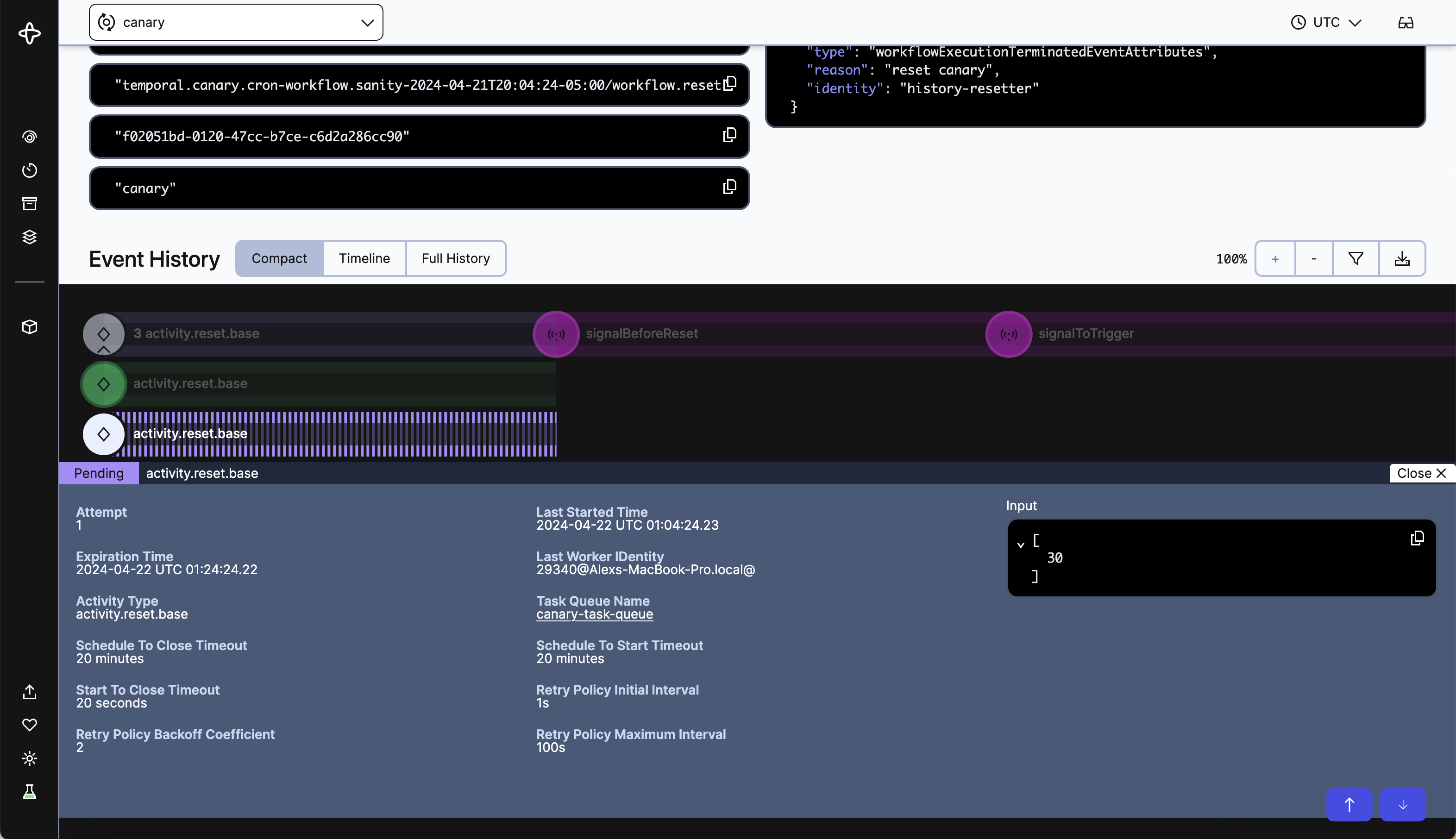
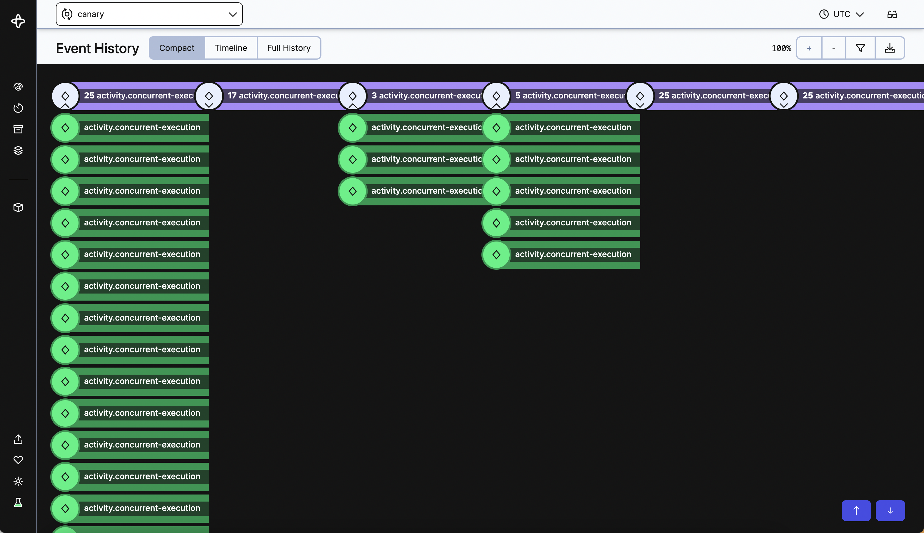
The Compact view is the simplest view which represents a linear progression of Event Groups. The first scheduled Event Group is on the left, the latest scheduled group is furthest to the right. Event Groups that are scheduled at the same time are stacked on top of each other vertically. If more than one of the same type of Event group - say 20 SendNotification Activities are scheduled at once - the Compact view will group them under a single line with a count. You can expand that line to view each individual Event Group, and clicking on an Event Group will open the summary details. Let’s take a look below at some screenshots that show this in action.
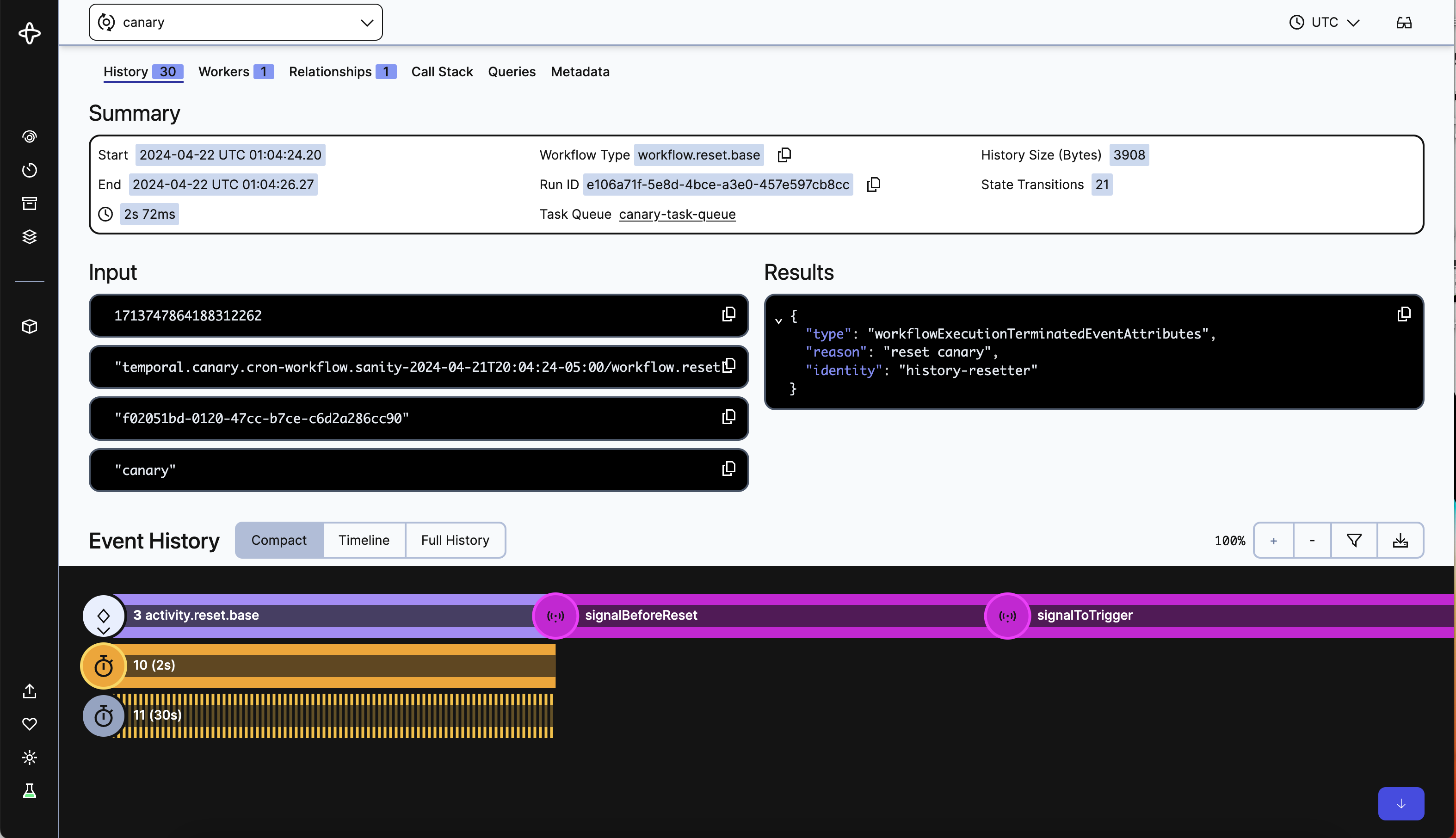
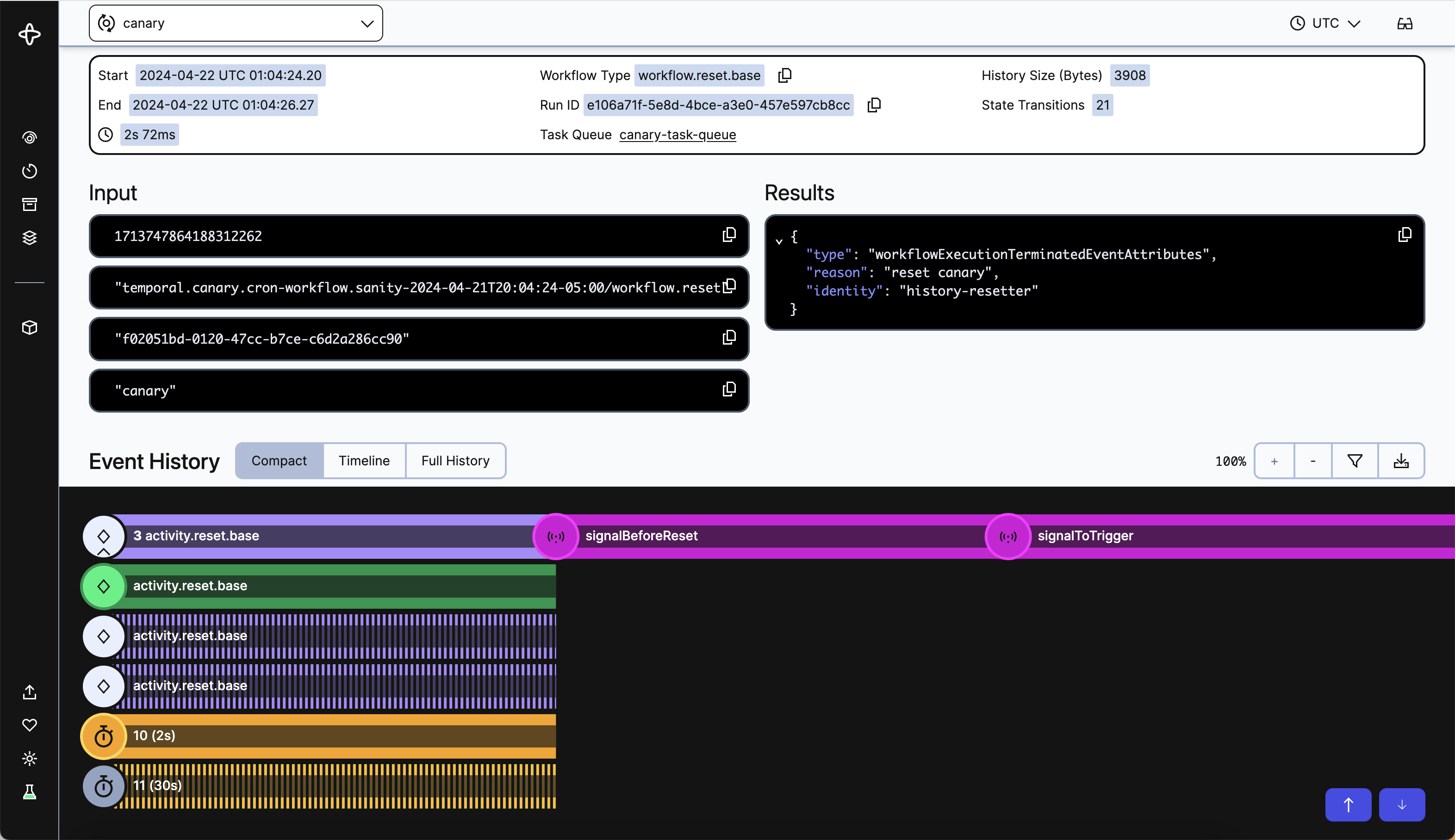
The Compact view does not take clock time into consideration. Simply what happened, in what order. This view is very helpful for consolidating complex Workflows and giving a quick understanding of what happened.
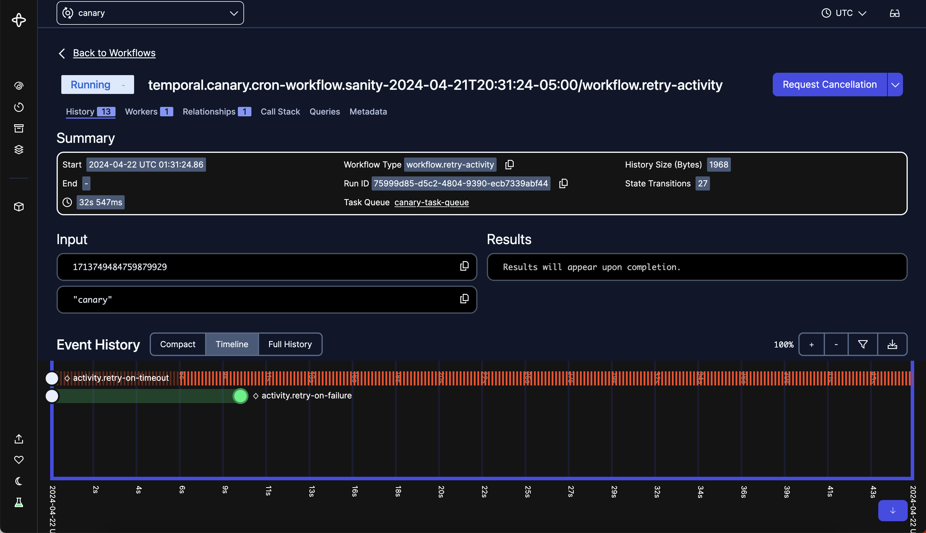
Timeline
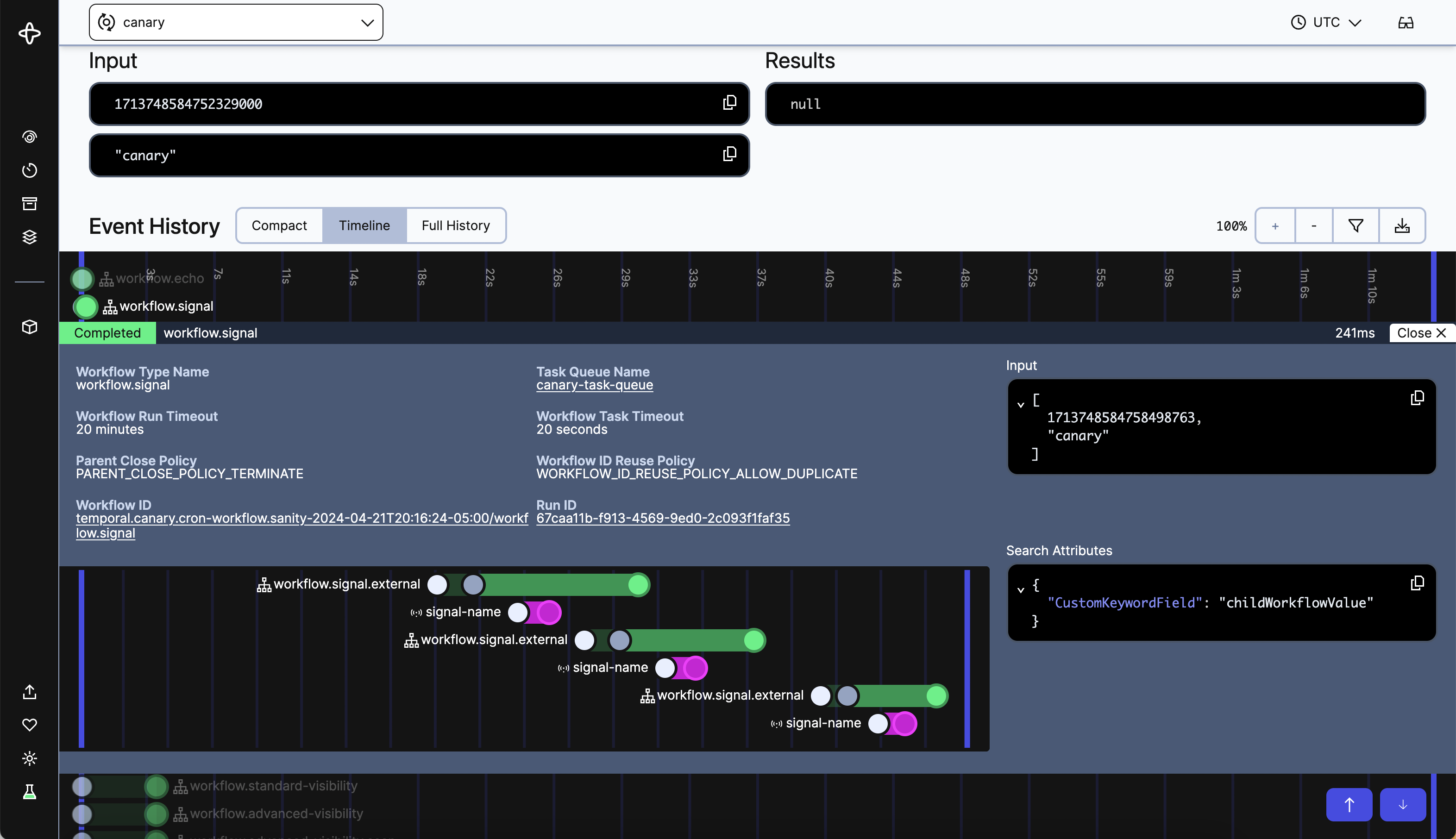
We’ve taken the work of our current Timeline and improved upon it. Event Groups are stacked vertically, with clock-time durations as the length of each line connecting Events. The time axis and positions of lines and dots are updated in real-time for running Workflows. All Event Group labels are adjusted for readability depending on the position of the Event Group. You can open multiple Event Group summary details to compare Event Groups.
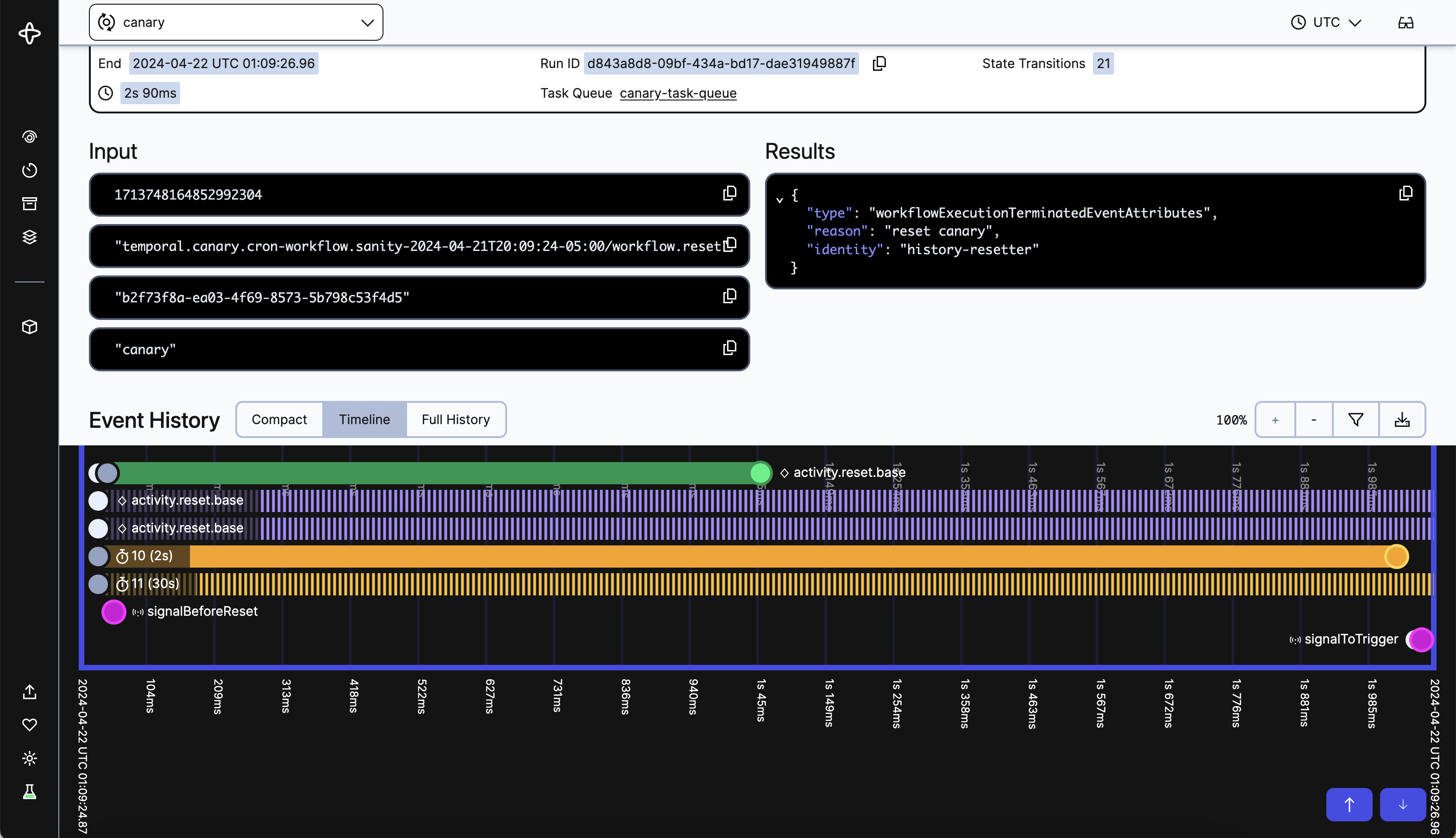
Let’s take a look at the same Workflow as the first three screenshots above. Here you can see the duration of each Event Group and at what time each Event occurs. It’s also clear that two Activities are still pending and one Timer has yet to fire.
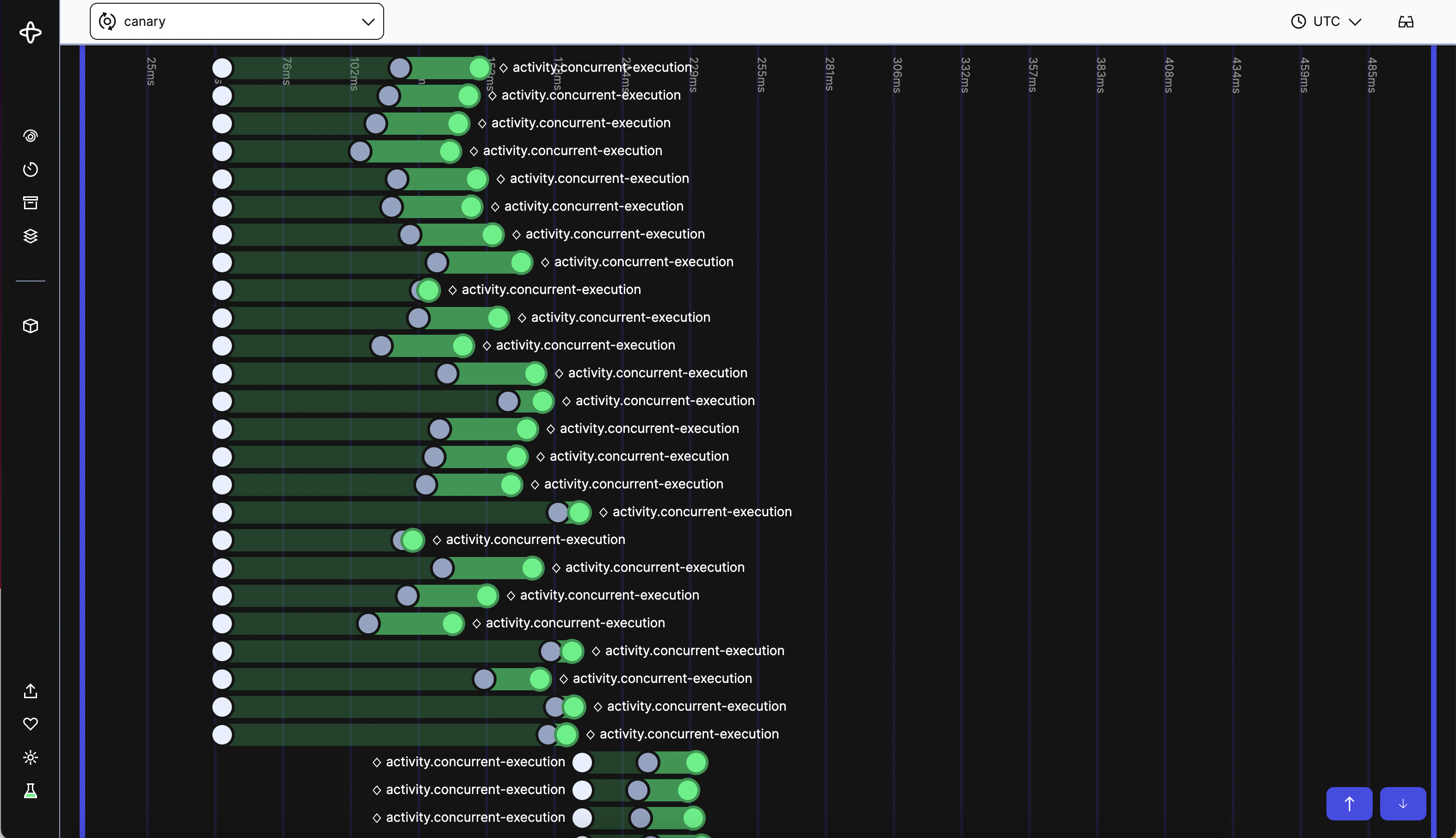
Now let’s start looking at some more complex Workflows. Here you can see the latency between each Event in its Event Group, with some showing greater latency between Scheduled and Started, while others have higher latency between Started and Completed Events. The time axis labels gives you a sense of relative duration between Events. All lines and dots are green to show everything has completed without issue.
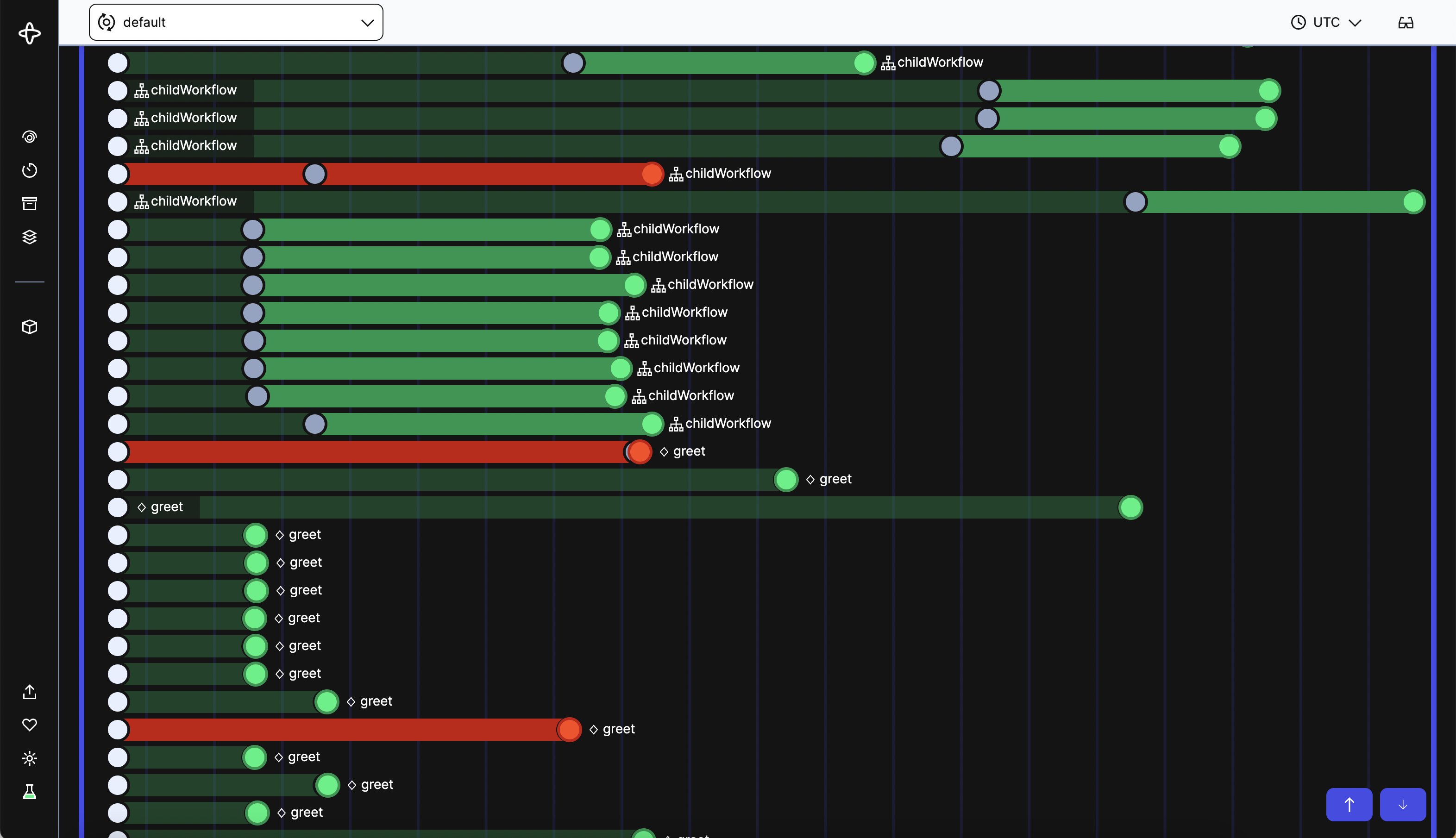
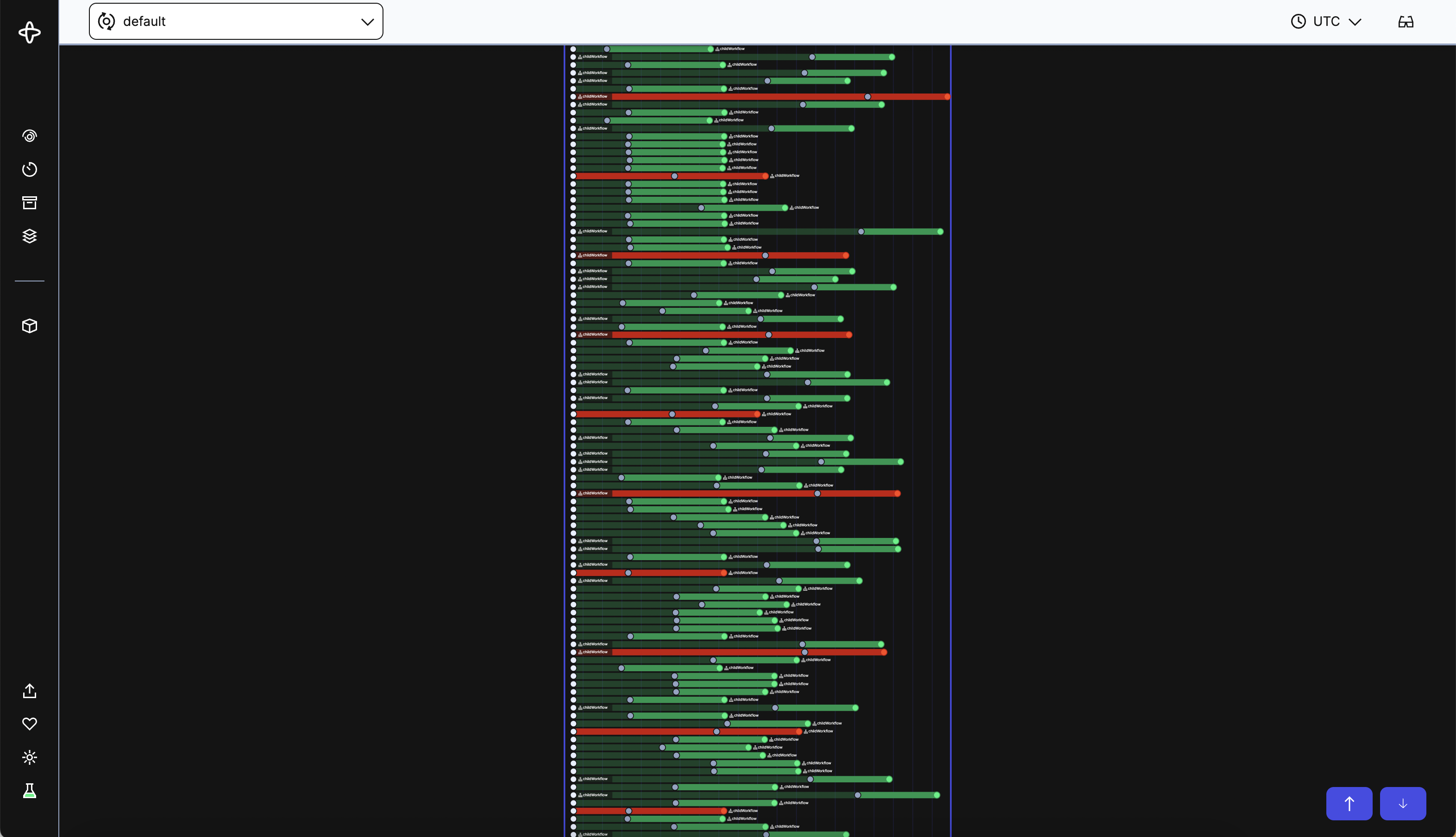
In the next Workflow it’s immediately clear that something is wrong, red lines and dots pepper the screen due to failing Child Workflows and Activities. You can use the zoom out functionality to get a better big picture view of the Workflow as well.
One of the most useful new features with this UI is the ability to see the Timeline view of Child Workflows without having to navigate away. You can open a Child Workflow Event Group and in the summary details view its Timeline. This ability is available in both the Compact and Timeline view summary details.
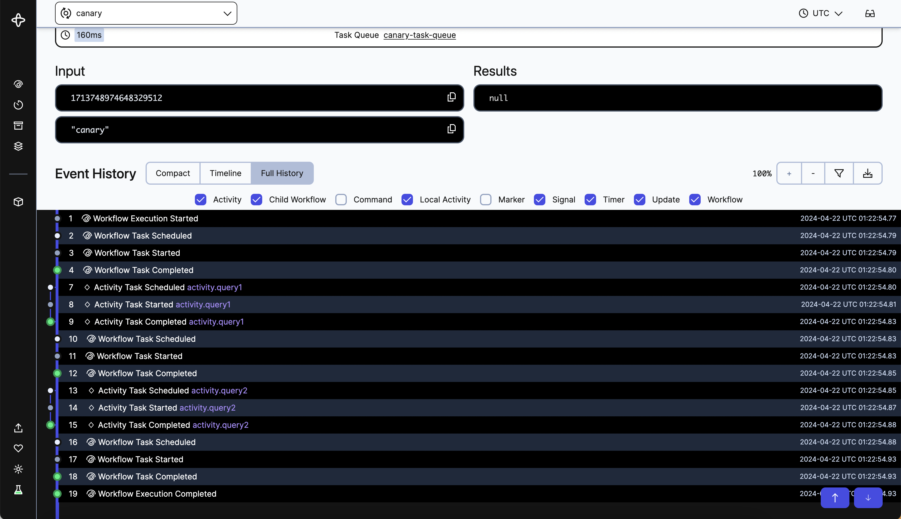
Full History
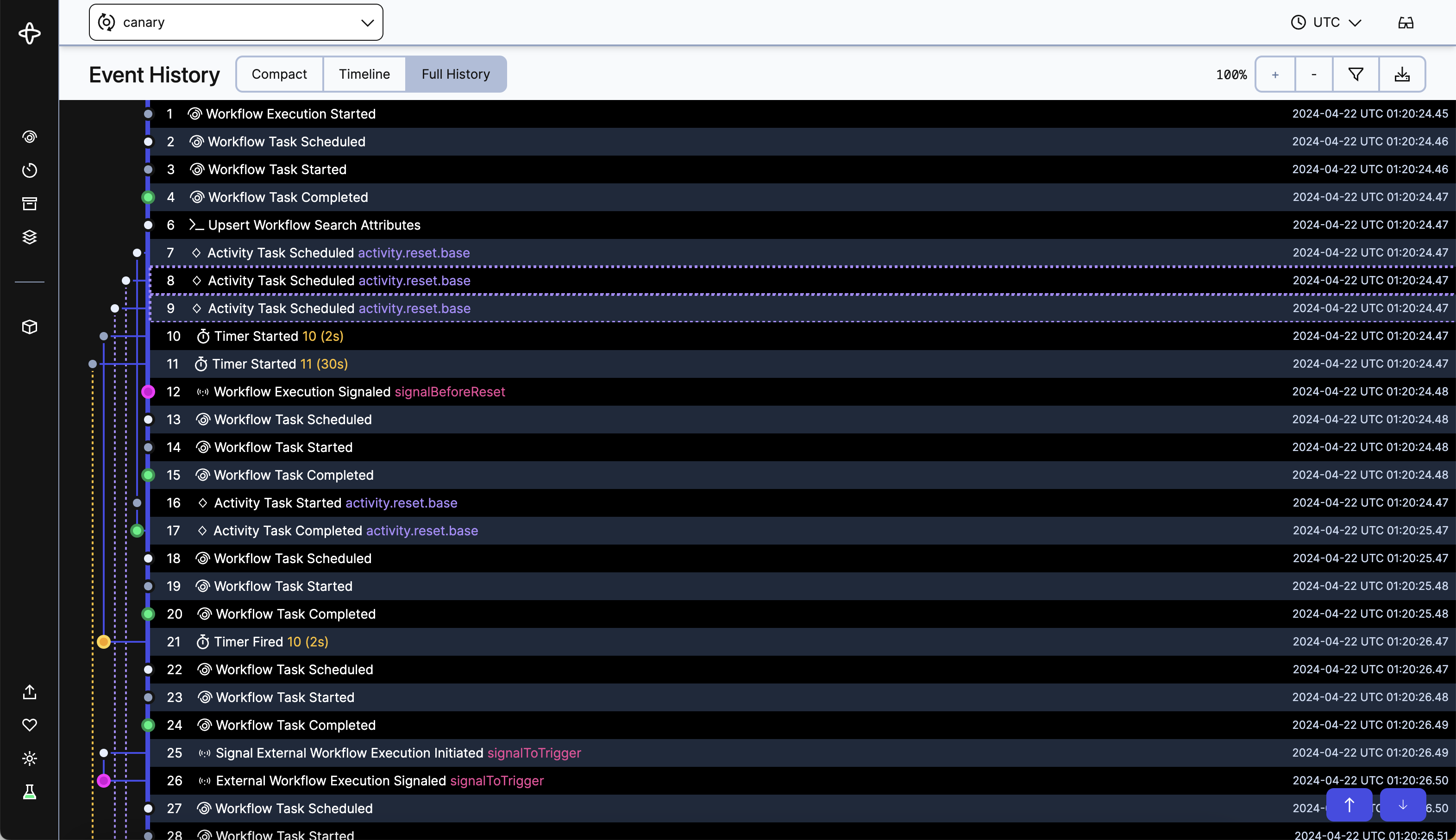
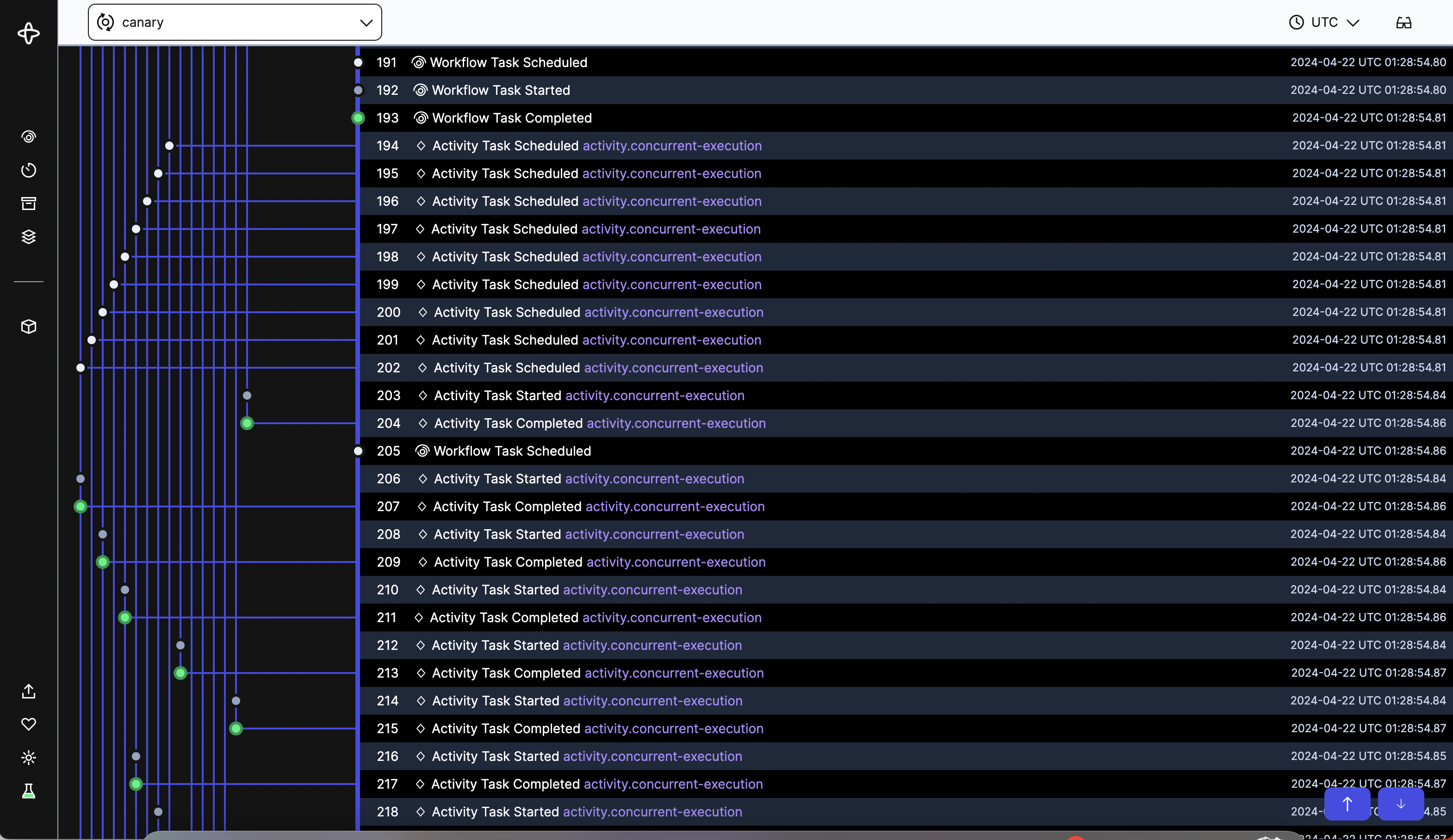
The Full History view is for when you need all the low-level details, including Workflow Tasks. In the style of a git tree, the view shows all Events in the Event History and connects Events in the same Event Group.
Again let’s take a look at the same Workflow as the first three screenshots but in the Full History view. You can see colored dots indicating the status of the Event and lines connecting related Events. The thicker main line represents the Workflow - Workflow Tasks and Workflow Execution Events (all non-Event Groups) with Event Groups branching out from it.
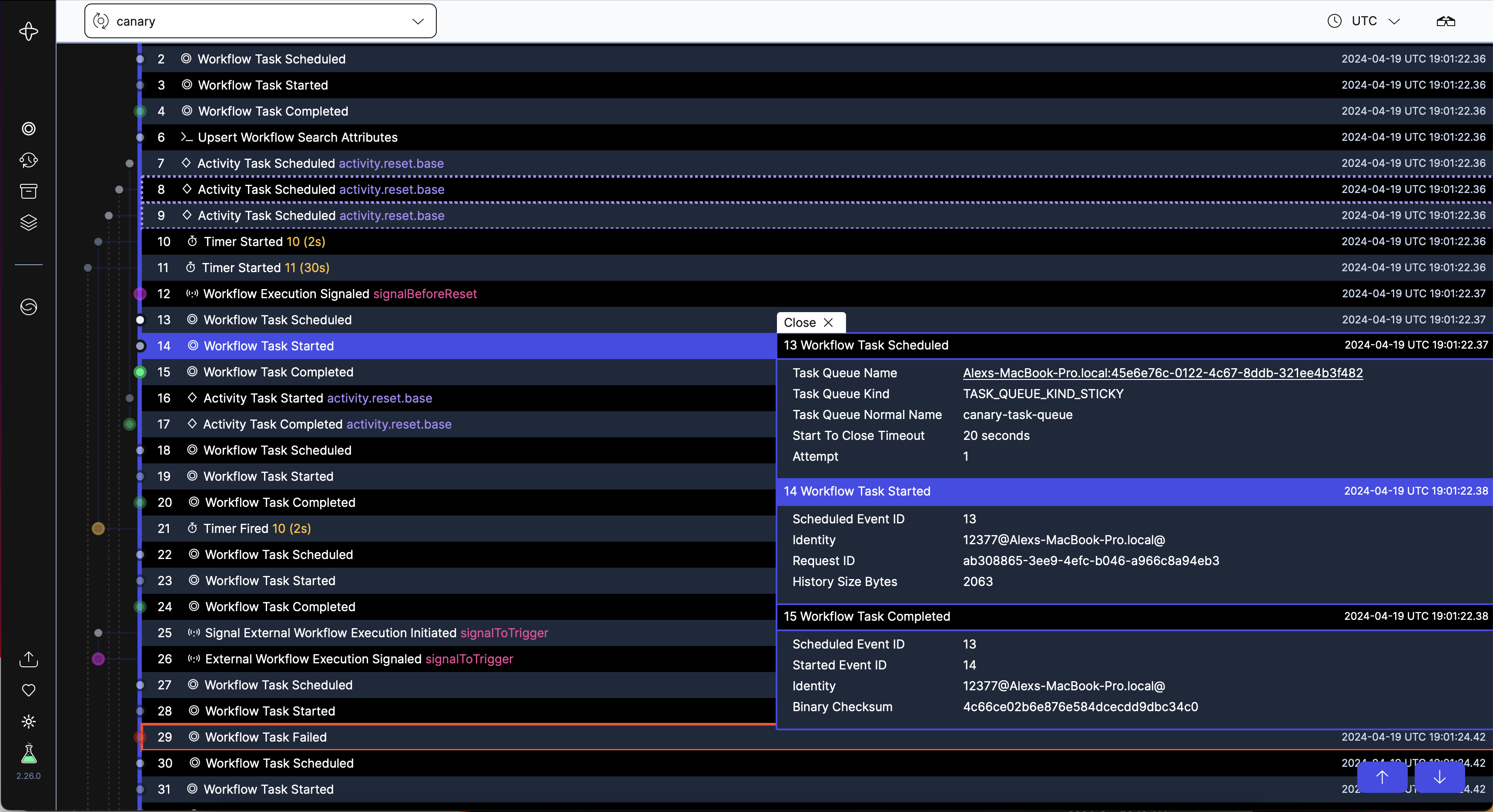
When you click on a row in the Full History view, not only will you get the full details of that Event, but also the details of the other Events in the Event Group. The dots and lines of the unopened Event Groups will fade to make opened Event Groups stand out.
You can start to see patterns of the Event Groups in relation to the Workflow Tasks that started them.
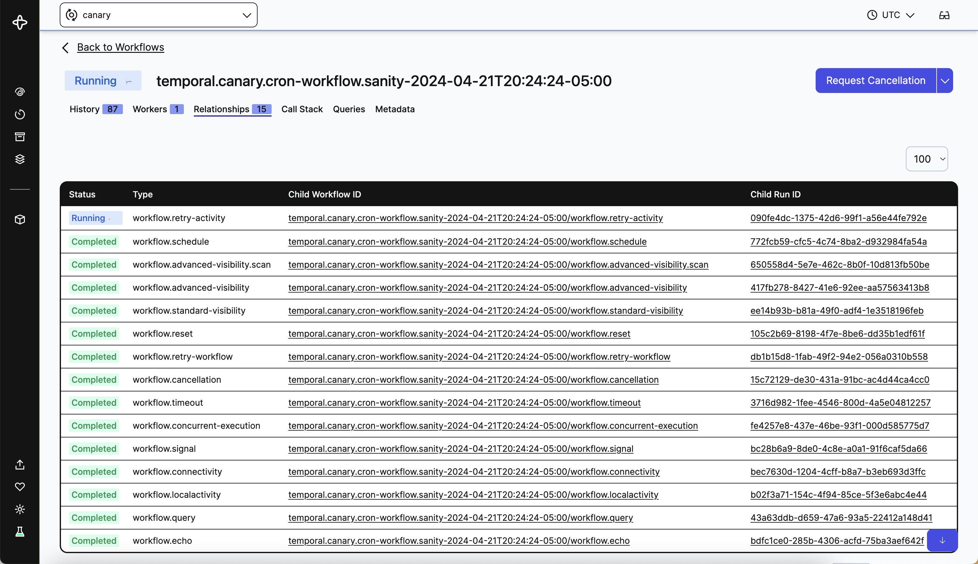
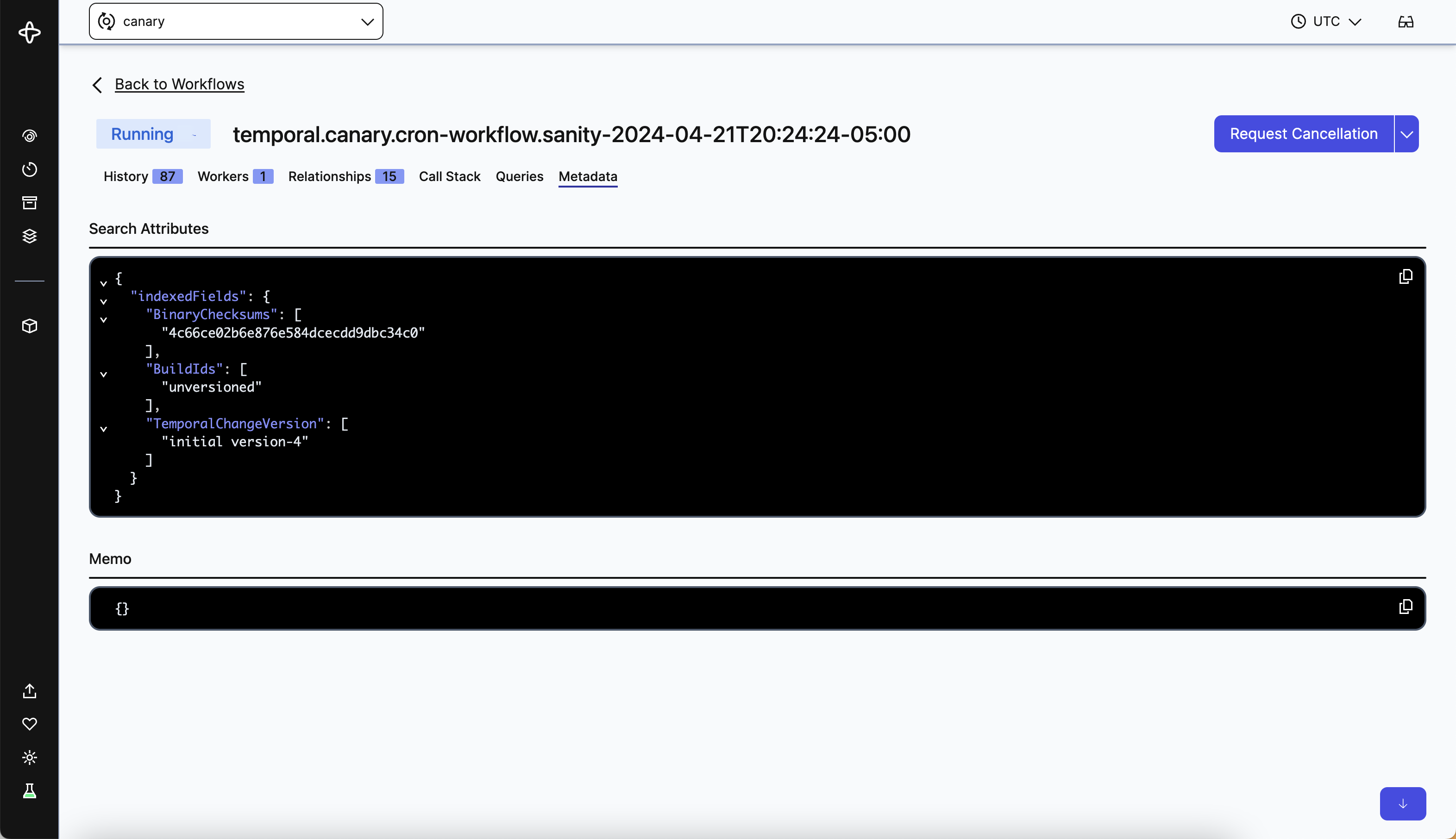
Filters and Tabs
You can filter by multiple Event Types in all the views to only see the things you care about. We’ve also moved Relationships (Children, Parent, Next, Previous Workflows) to its own tab, and added the Metadata tab to show Search Attributes and Memo fields of the Workflow. This clears up the initial History tab to show only vital information.
Accessing the New UI
Starting today, the new Workflow Execution UI with Compact/Timeline/Full History views will be available to everyone in Cloud and Open Source. With change of this magnitude, we want to give you the ability to access the old UI if you so desire. To switch on and off the new UI, you click the Labs Mode icon in the bottom left navigation. By default Labs Mode will be turned off.
Dark Mode
Another much-requested feature we’ve added is Dark Mode! We’ve added Day and Night themes for all pages within the UI to ease eye strain when you need to debug Workflows late at night.
To try out Dark Mode, turn on Labs Mode to get the Day / Night icon in the bottom left navigation. Dark Mode is only available in Open Source right now, but will be coming to Cloud soon.
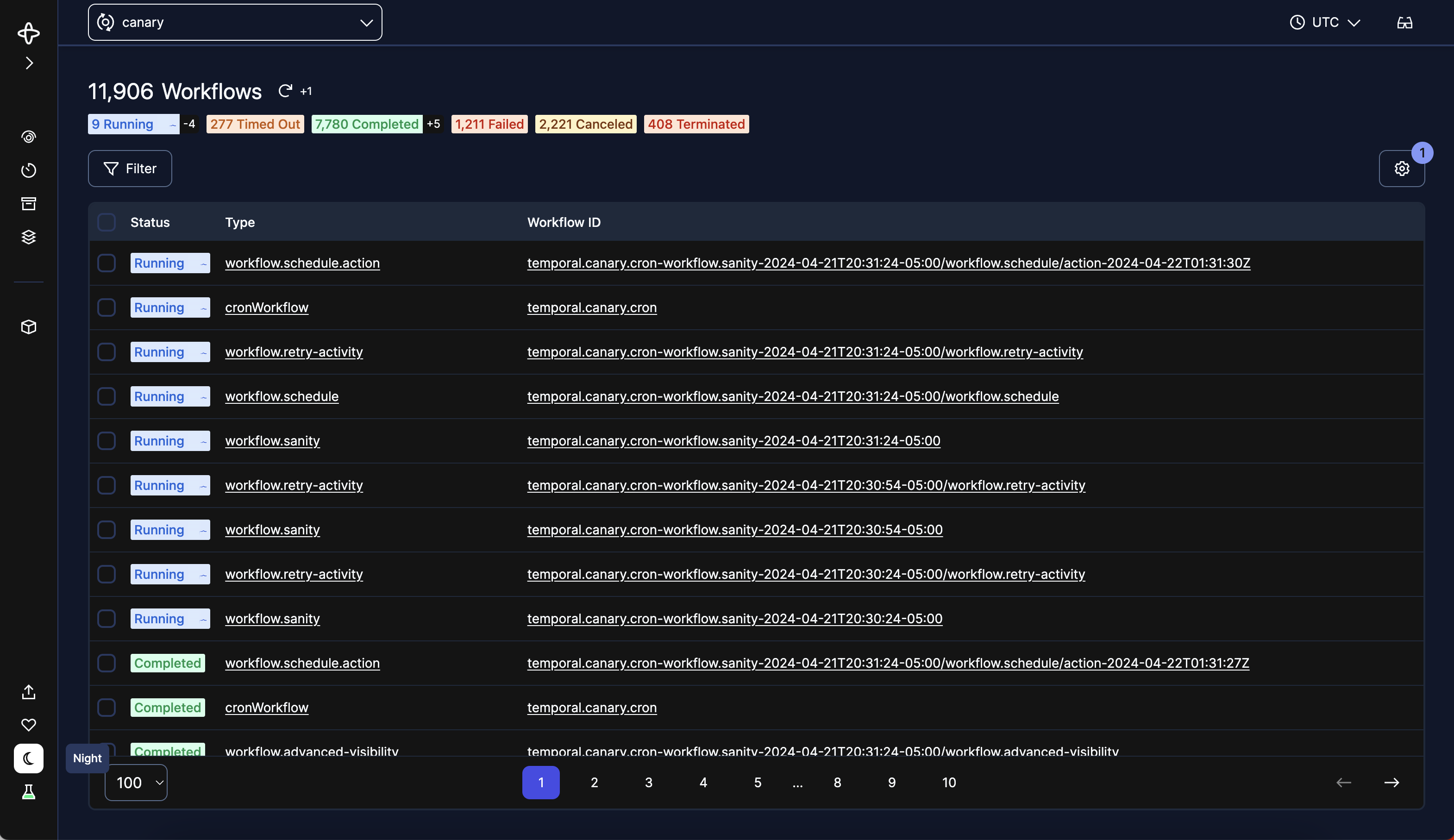
Child Workflows
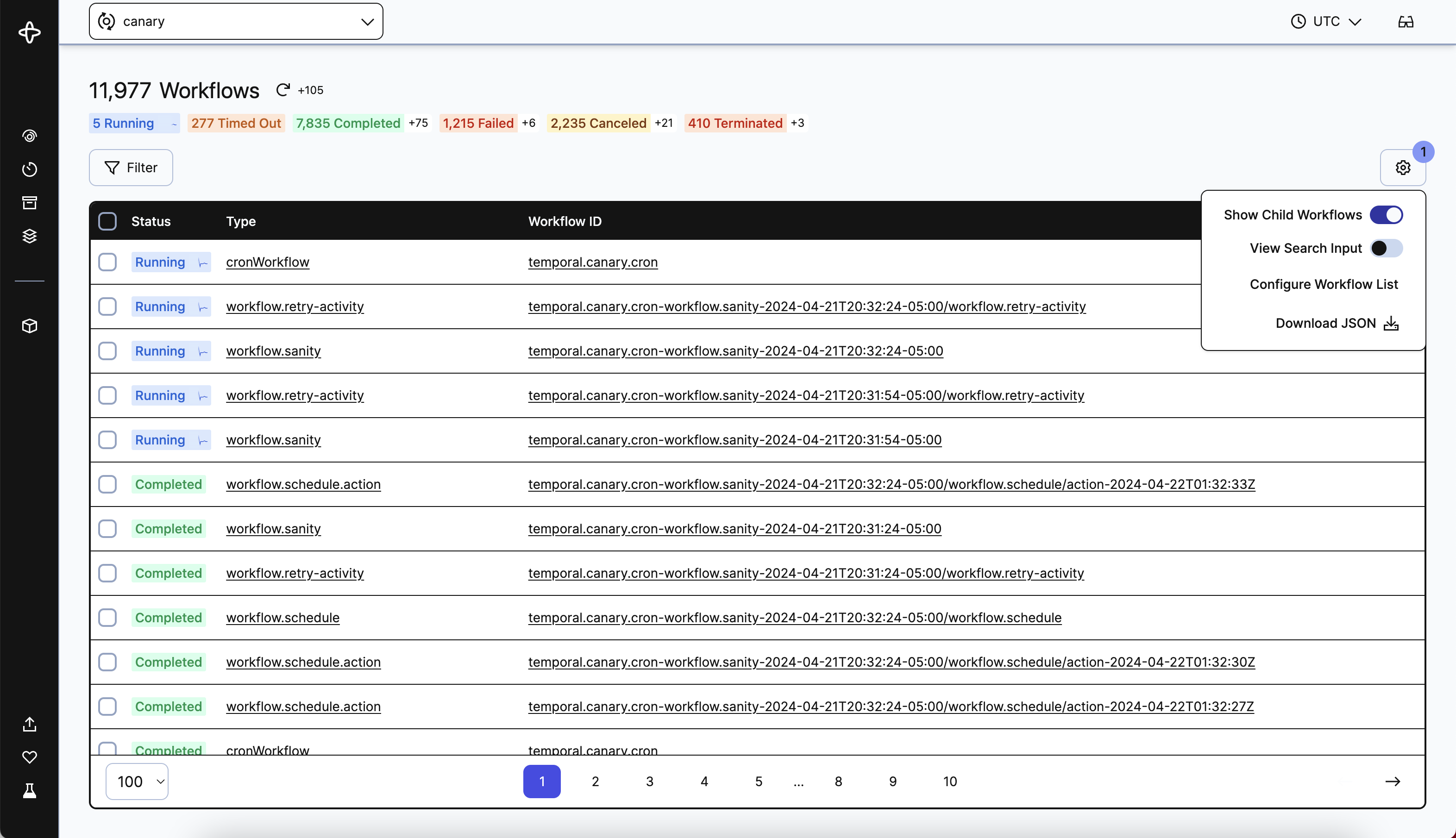
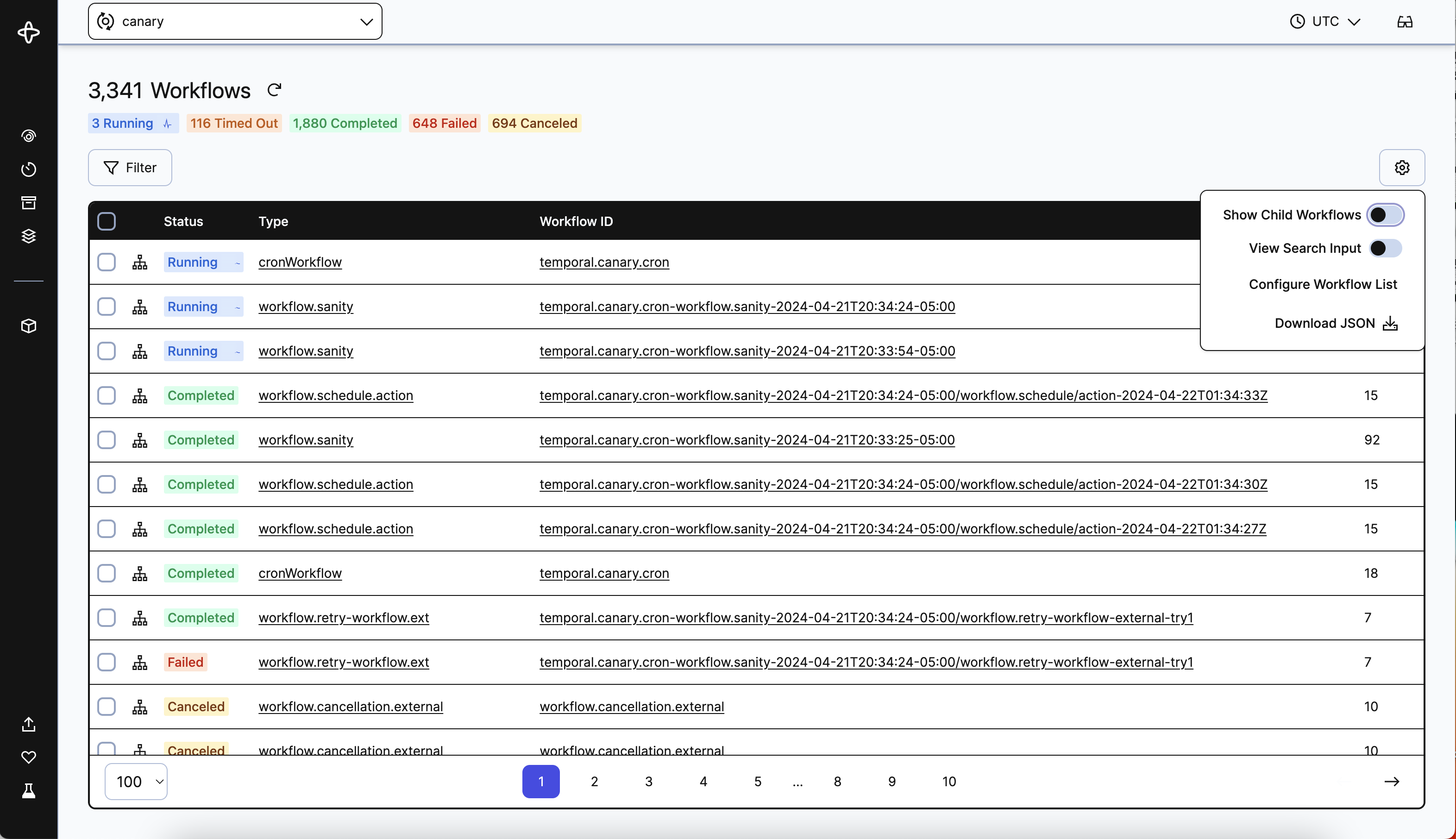
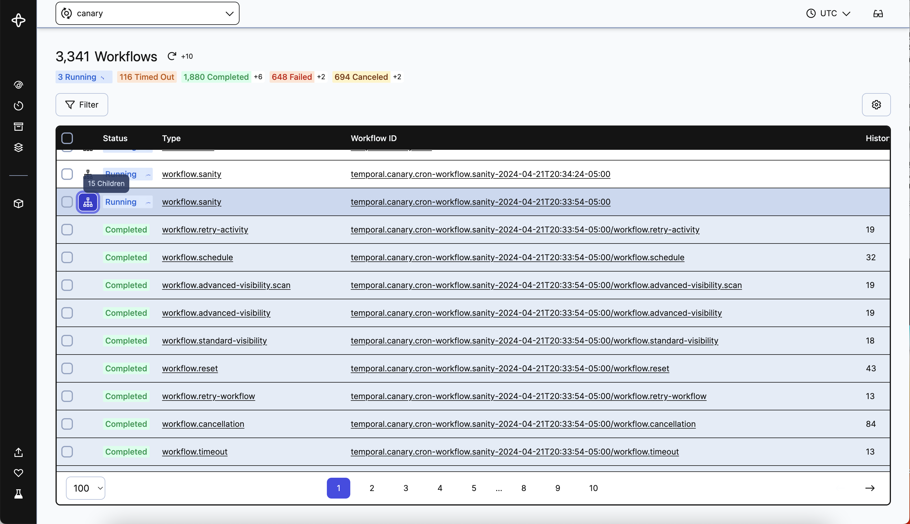
Another new feature to highlight is the ability to hide Child Workflows in the Workflow List. By default Child Workflows are listed, but when toggled off all Workflows with a ParentWorkflowId will be removed. You can still view Child Workflows for a Workflow by clicking the Child Workflow icon button in the row. A tooltip will give a count of the number of Child Workflows as well. This is available today for both Cloud and Open Source and you will not need to turn on Labs Mode to access it.
We hope you find these new updates helpful, and as always, feedback is very much appreciated!